Field Notes
Cinematography & digital camera workflows from a Sony Venice & FX owner, operator and DOP.
This blog is a working journal — a place to collect thoughts, tests and observations from the day-to-day of cinematography. It covers lighting, workflows, ideas, colour and camera quirks, mostly centred around Sony systems (I own on a Venice, and previously used the FX6 and FX3), though RED and ARRI cameras make the occasional appearance.
It’s mainly written for other professionals — particularly camera assistants, operators, Sony users and aspiring cinematographers — but I’ll be honest, I don’t expect most people to find it interesting. It’s a mix of technical notes, experiments and the kind of daydreamy thoughts I suspect only 1% of us ever think about. But if you are in that 1% — welcome!
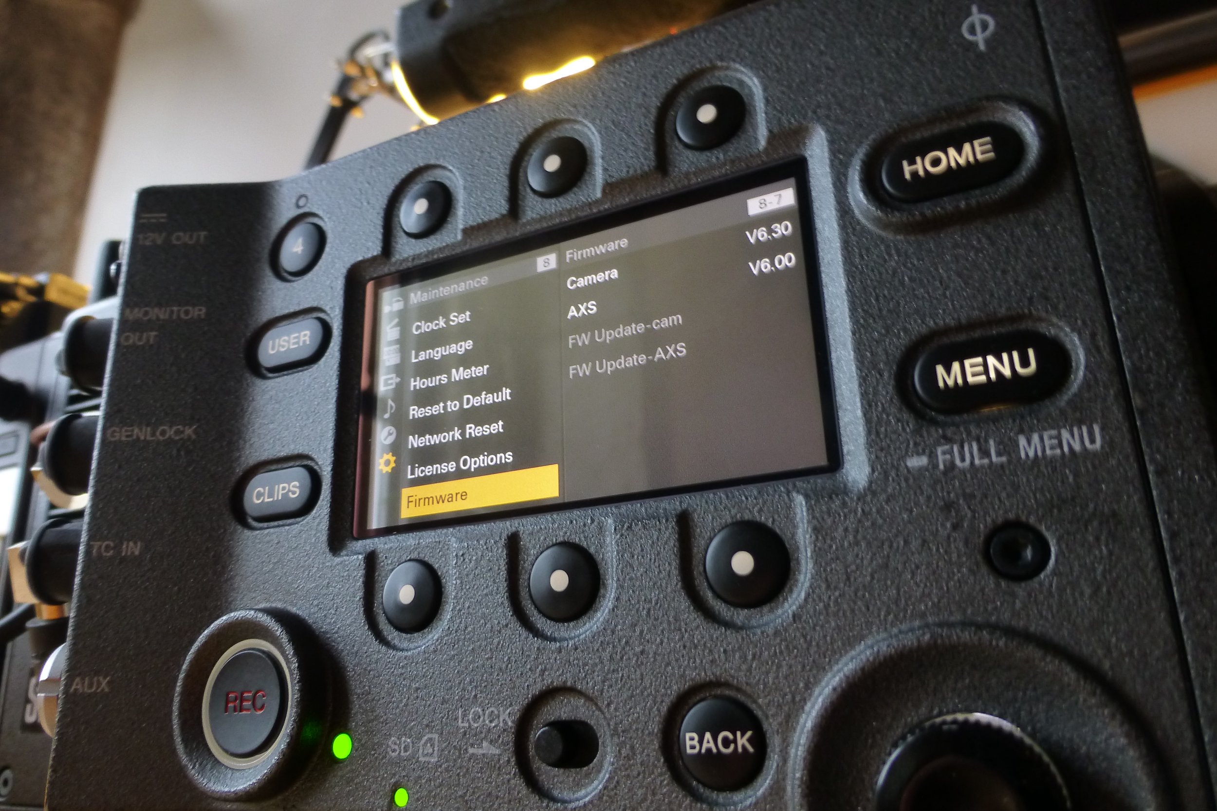
Updating a Sony AXS-R7 5.0 for Venice 6.3
This isn’t a great story. It is a useful one.
What follows isn’t a love letter to kit or a poetic meditation on cinema cameras. It’s a technical puzzle, the sort that eats half a day, your patience and a chunk of faith in AI and online documentation. I’m writing this so if you ever find yourself in the same situation, you don’t have to go through the same thing.
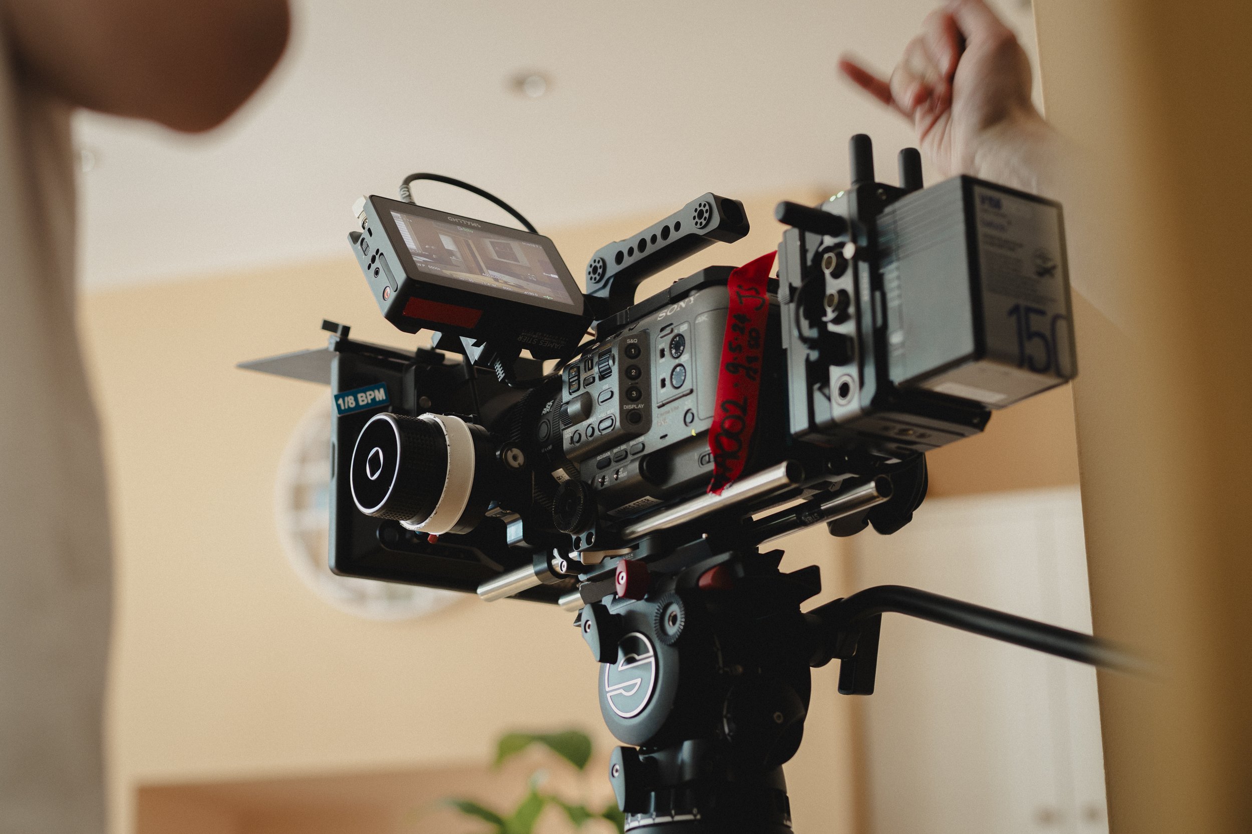
Titanium, Coffee Mugs & Camera Rigs
I mean, seriously—how did we get here? A grown man, writing about titanium rods. I once knew a producer who drilled holes in his toothbrush to shave grams while trekking the Himalayas. That’s the altitude of crazy we’re dealing with. Look up “first world problems” and my face is probably staring back at you.
North Light Observations
In our busy work lives, it’s rare and quite special to have time to creatively hang out with like-minded folk, in the right space with the right tools. Not to chase anything in particular, but simply to play.
That was the spirit behind our recent lens and camera test at North Light Film Studios, tucked inside the beautifully atmospheric Brookes Mill in Armitage Bridge, Huddersfield.

Foot Candle Calculator
For years I’ve carried around a photo of the old American Cinematographer Manual foot-candle table on my phone — the one that lists how many foot-candles you need for a given ISO/ASA/EI at a given f-stop.
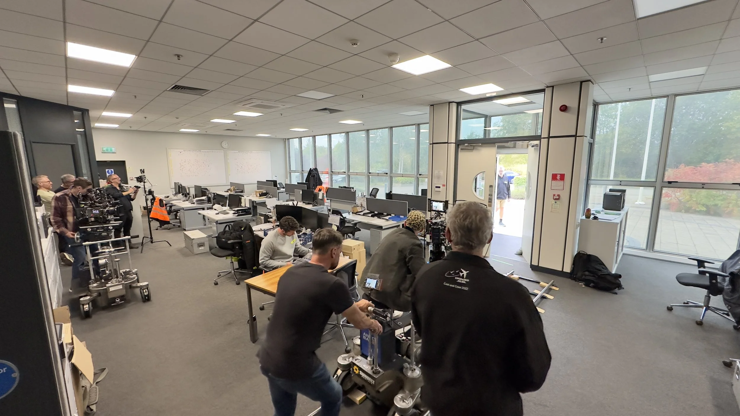
ACO Workshop - Geared Head & Crane at Sunbelt
Last weekend I had the privilege of joining a workshop run by the Association of Camera Operators (ACO) at Sunbelt Rentals here in Manchester. The focus was the geared head - that mythical set of wheels you’ve probably seen behind the scenes on classic films.
Don’t trust your dad’s TV
I’m pretty sure we’ve all seen it — either in a Curry’s store in the mid 00s or in our parents’ front room: Dad stood in front of a brand-new TV, remote in hand, turning the sharpness all the way up because “you can see more detail,” then cranking the saturation until everyone on screen looks like they’ve just come back from a fortnight in Marbella.