Don’t trust your dad’s TV
Calibration Day
I’m pretty sure we’ve all seen it — either in a Curry’s store in the mid-00s or in our parents’ front room: Dad stood in front of a brand-new TV, remote in hand, turning the sharpness all the way up because “you can see more detail,” then cranking the saturation until everyone on screen looks like they’ve just come back from a fortnight in Marbella. To Dad, that’s the best picture. To those of us who make images, it’s a reminder that without the right tools and standards, image quality quickly becomes a matter of personal taste rather than objective accuracy.
That’s essentially the problem I have with my uncalibrated monitors. If I’m relying only on my eye — or whatever the factory defaults happen to be — I’m working to someone else’s standard. The image might look fine in the moment, but the second someone else views it on another screen, the illusion shatters.
Colour calibration is the process of making sure your monitor shows you the world as it really is — or at least, as the standards say it should be. Without it, you’re essentially grading blindfolded, nudging sliders and wheels until the image looks “about right” on your screen, but with no guarantee it’ll look that way anywhere else.
I was reminded of this recently on a trip to the US. I bounced between several monitors — some rentals, some supplied, some my own — and the same camera footage looked different every time. On one screen it was warm and glossy; on another, hard and cold. Throw in a mix of cameras and lenses, and the variations multiply. It was a sharp reminder that unless I have a consistent pipeline from set to post, I’m essentially gambling with my images.
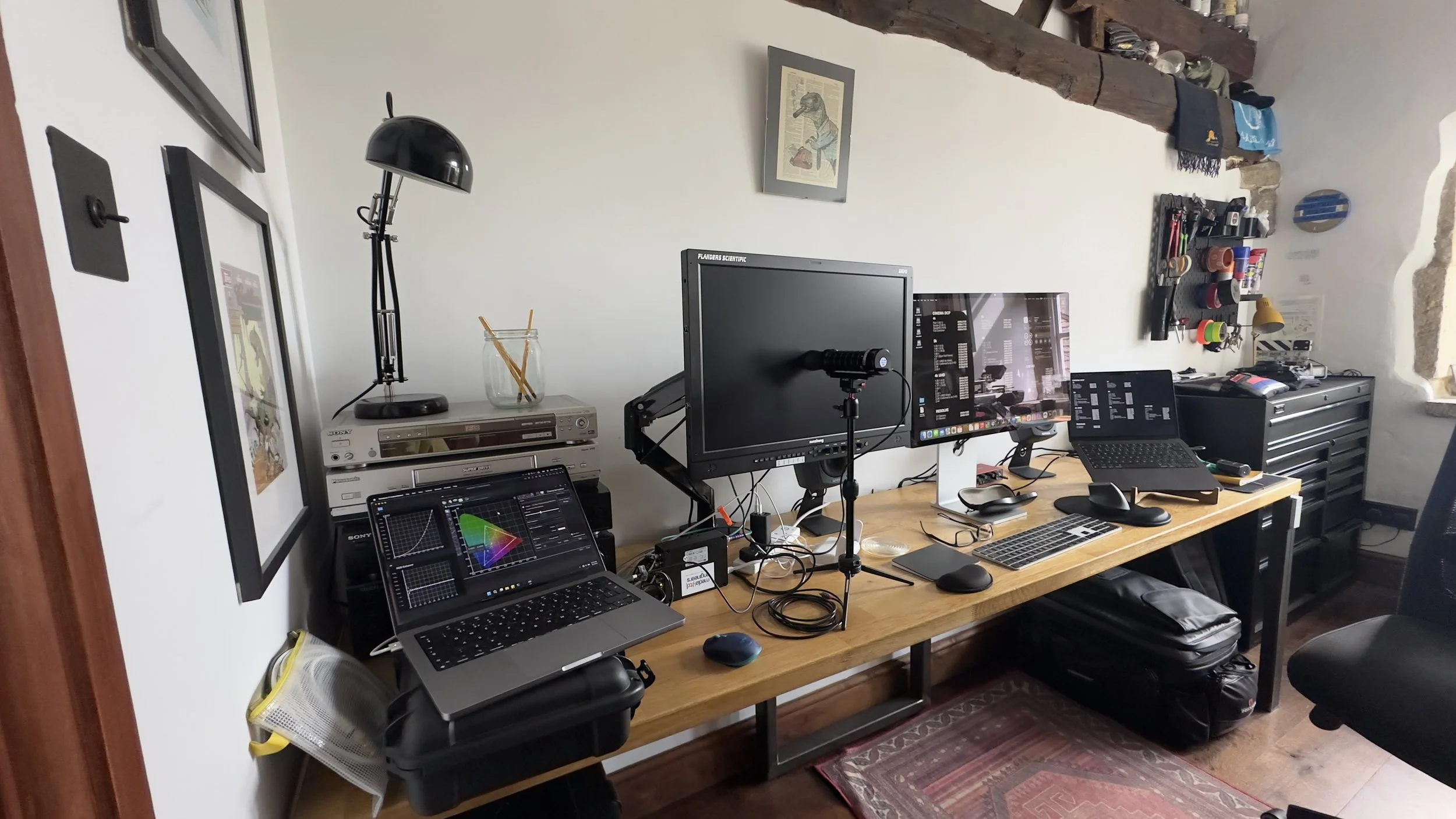
As someone who occasionally grades projects for others, but spends most of my time colouring my own work, I’ve learned how critical calibration is to building trust between production, post and client. For me, consistency starts with my Flanders DM241. It lives in my office when grading but also comes on set when possible. On a recent shoot in the Cotswolds with Dave Hackney and Digital Cortex, we ran both a Sony and a Blackmagic camera into the Flanders using PAP (Picture and Picture). Seeing them side by side on the same calibrated panel made lining them up straightforward. When everything runs through a trusted reference monitor, arguments about colour disappear.
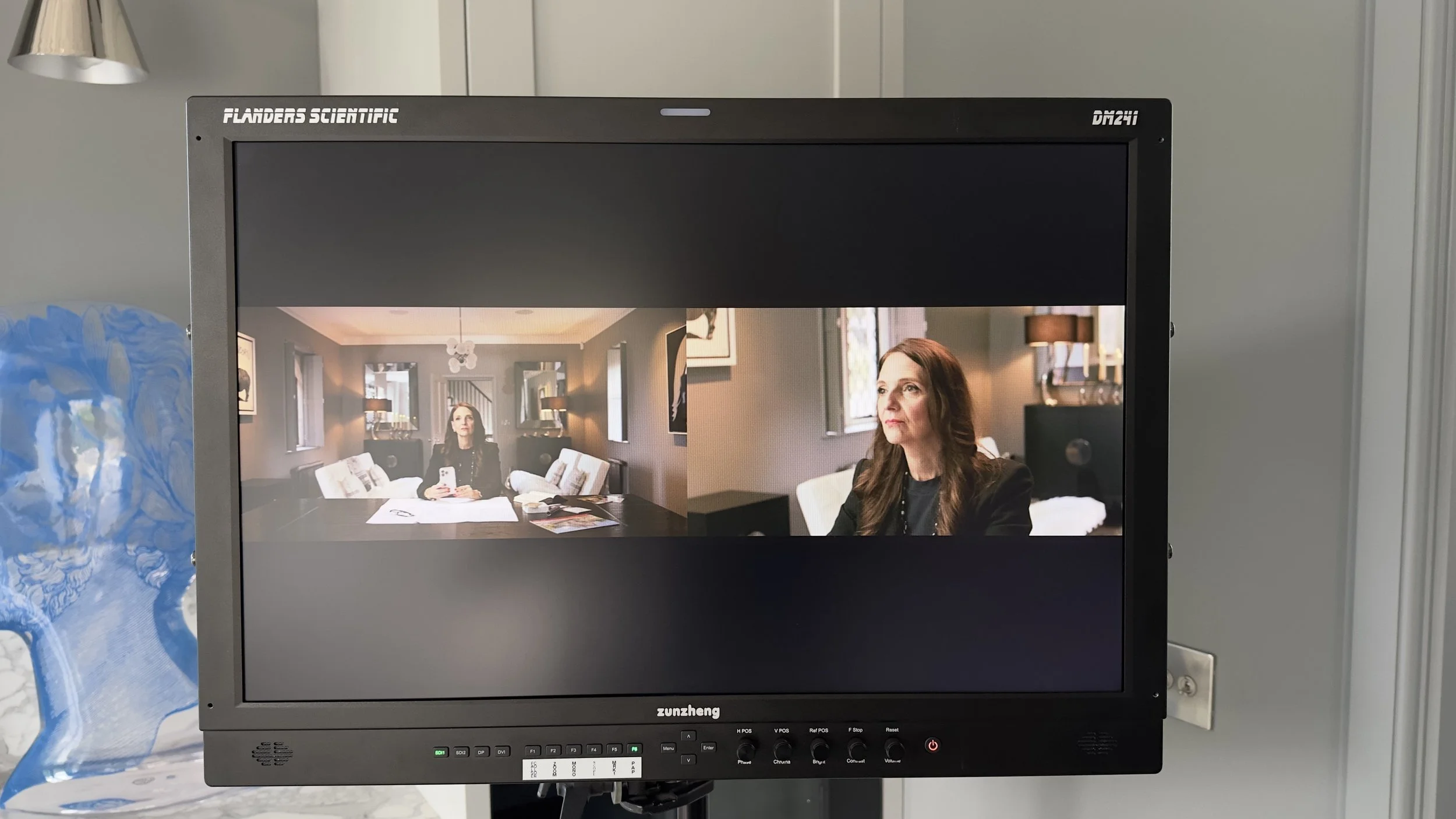
Venice & Blackmagic - Side by Side
The problem is when I can’t bring the Flanders. I’ve got two SmallHDs — different sizes, bought at the same time — and they’ve never matched. These often get split across A and B cameras when I can’t justify hauling the Flanders, and the mismatch in colour is obvious. Brightness I can work around thanks to EL Zone exposure, but when one monitor leans magenta and the other green, it’s a headache. And just to note, especially when matching an Atomos with other brands: many of my own tests — and those of colleagues — show that Atomos units (like the Ninja V) assume legal/video/limited range (16–235) even when the camera is outputting full/data range (0–255). That mismatch leads to highlight and shadow clipping, with parts of the image crushed or lost because the monitor is remapping values outside its assumed range.
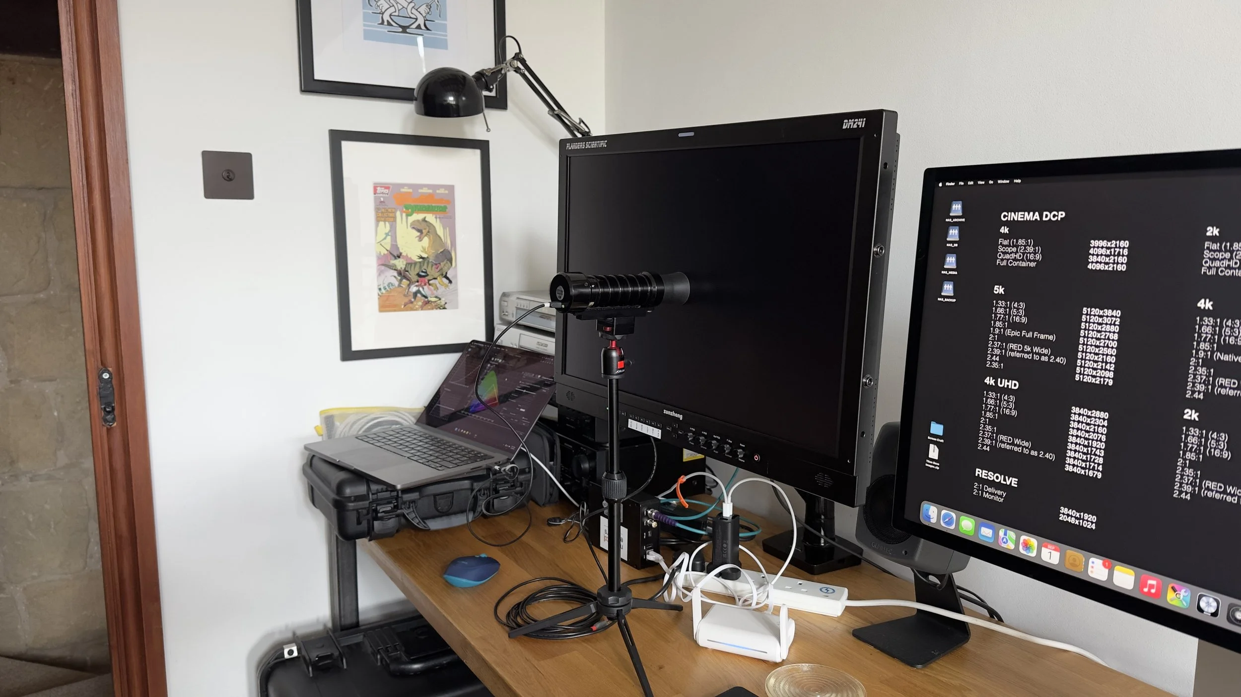
Video levels aside, my main concern is getting consistent colour across all my displays. I considered tackling calibration myself but decided to bring in someone who lives and breathes it. That’s where Victor Aberdeen, a professional calibrator with Media Engineers, came in. With his help, we put the Flanders through its automatic calibration routine — painless, quick, and the result was a neutral, trustworthy picture. Essentially, Victor updated the built-in calibration LUT which now holds the corrected values.
The SmallHDs took more work. While it is technically possible to update their default LUT, Victor advised it is best to use the built-in controls to adjust the calibration without the need to build a LUT, which should ideally only be required for significant corrections. This also allows the monitor to be restored to a calibrated state quickly after a reset, without having to dig out and reload the right LUT file. So, he calibrated them manually: carefully adjusting white point, gamma, and RGB balance patch by patch. It’s slower and less elegant than running an auto-routine, but it meant both monitors could be brought close enough to match and remain consistent in real-world use.
Flanders DM241
Cine 5, Cine 7 and Flanders DM241
When we put the three monitors side by side and ran full calibrations, the differences were stark. Each one has its role, but the numbers reveal where they shine and where they fall short.
Some technical notes:
dE2000 (Delta E): A measure of colour error. Under 2 is “invisible,” above 3 is noticeable.
Gamut coverage: How much of Rec.709 the monitor can physically display. 100% is ideal as I’m usually delivering in 709.
EOTF / Gamma: How the monitor renders brightness. Target is 2.4; lower numbers make midtones look too bright.
Greyscale tracking: Accuracy of neutral tones (black to white). Errors here create colour casts in skin tones or highlights.
SmallHD Cine 5: Once calibrated, it’s reliable enough for on-set use. Greyscales are solid, meaning skin tones and exposure hold up, but it struggles with fully saturated colours. With EL Zone handling exposure, it’s a solid A/B camera monitor but not something you’d want to rely on for truly accurate colour decisions.

Calibration Report - Small HD Cine 5
SmallHD Cine 7: Covers more of Rec.709 than the Cine 5, so it can technically show more colour, but its accuracy was weaker before calibration. Greyscale drifted more, and over 100 of the test patches showed visible errors. It’s great as a director’s monitor or for framing where monitor size matters, but I wouldn’t trust it for precise colour decisions.

Calibration Report - Small HD Cine 7
Flanders DM241: The clear winner — which, of course, it should be, as it’s designed for this purpose. Even though its measured gamut coverage sits slightly lower on paper, what it does show, it shows with near-reference precision. Greyscale is tight, gamma is accurate, and outliers are minimal. This is the monitor I trust to carry intent from shoot to post without bias.

Calibration Report - DM241
If you’re curious about the tools behind this process, check out ColourSpace from Light Illusion. The entry-level version, ColourSpaceZRO, covers a lot of ground and can help with manual calibration if you own a probe, while ColourSpacePro — the one Victor used with me — adds advanced functionality that goes way beyond my pay grade. Their guides and videos are also a brilliant way to understand how calibration systems work in practice. Thanks again to Victor for pointing me towards the references — and if you’re ever in doubt, he’s worth dropping a message.
Of course, not every workflow demands this level of scrutiny. For many productions, “close enough” really is good enough, and that’s a fair point. But for me — in my line of work, and no doubt fuelled by a streak of OCD — I try to keep things as accurate as possible from set through to post. More on that workflow to follow, as I’ll be testing a new colour meter from LIT Systems this month.
Because in the end, calibration is really about trust. It’s not about chasing technical perfection; it’s about making sure what I light and shoot carries through the pipeline without surprises. So yes, colour calibration still matters to me — maybe more than ever, as we juggle SDR and HDR, theatrical and streaming deliverables, and an endless array of devices where audiences will actually see the work. It’s the invisible craft that underpins the visible image. Get it wrong, and people notice. Get it right, and nobody thinks twice.
And while dads’ TV settings might swear blind that maxed-out sharpness and Marbella skin tones are the best picture, I’d rather start with a balanced, neutral standard — and build the look from there.