Lit Duo - Tint
A Camera - Grant Gillespie
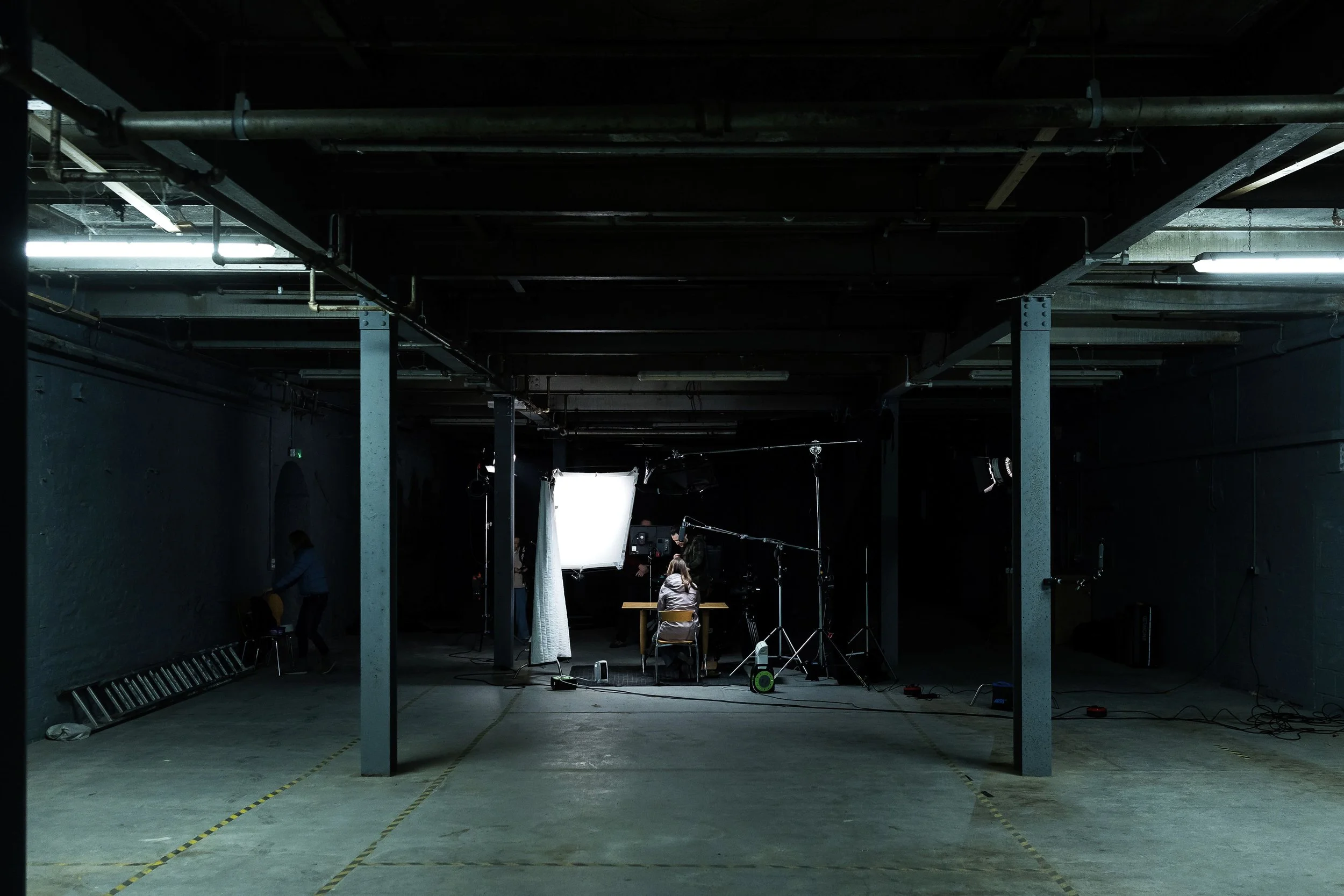
We didn’t arrive at Northlight Studios by chance. Previous test footage had already shown us how well the space worked for intimate, performance-led interview work. The scale, texture and industrial character of the studio gave us authority without artifice — exactly what this story needed.
That prior experience meant we weren’t guessing when the real shoot came around. We knew how the space behaved. We knew how it took light. That allowed us to focus less on discovery and more on refinement.
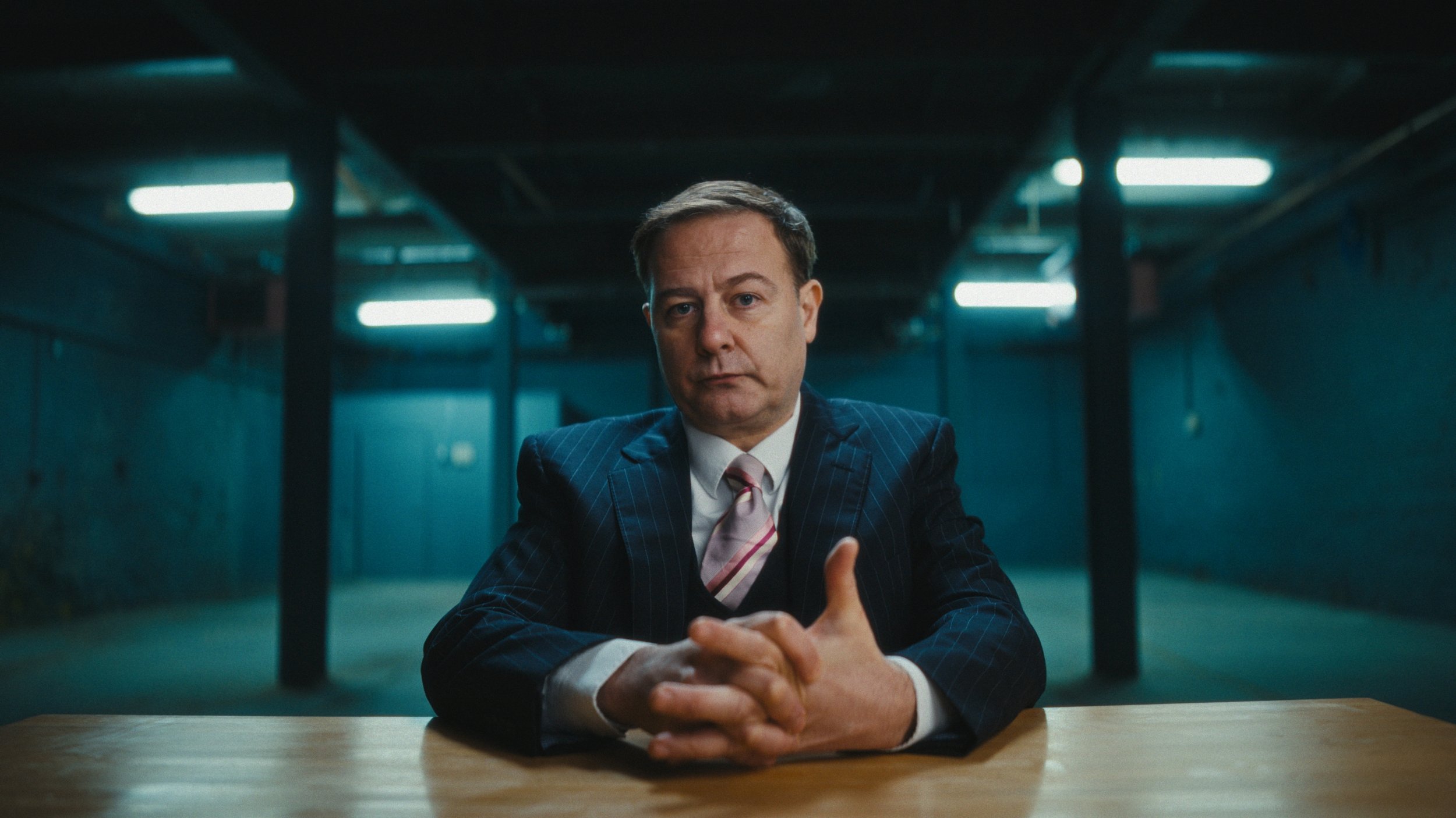
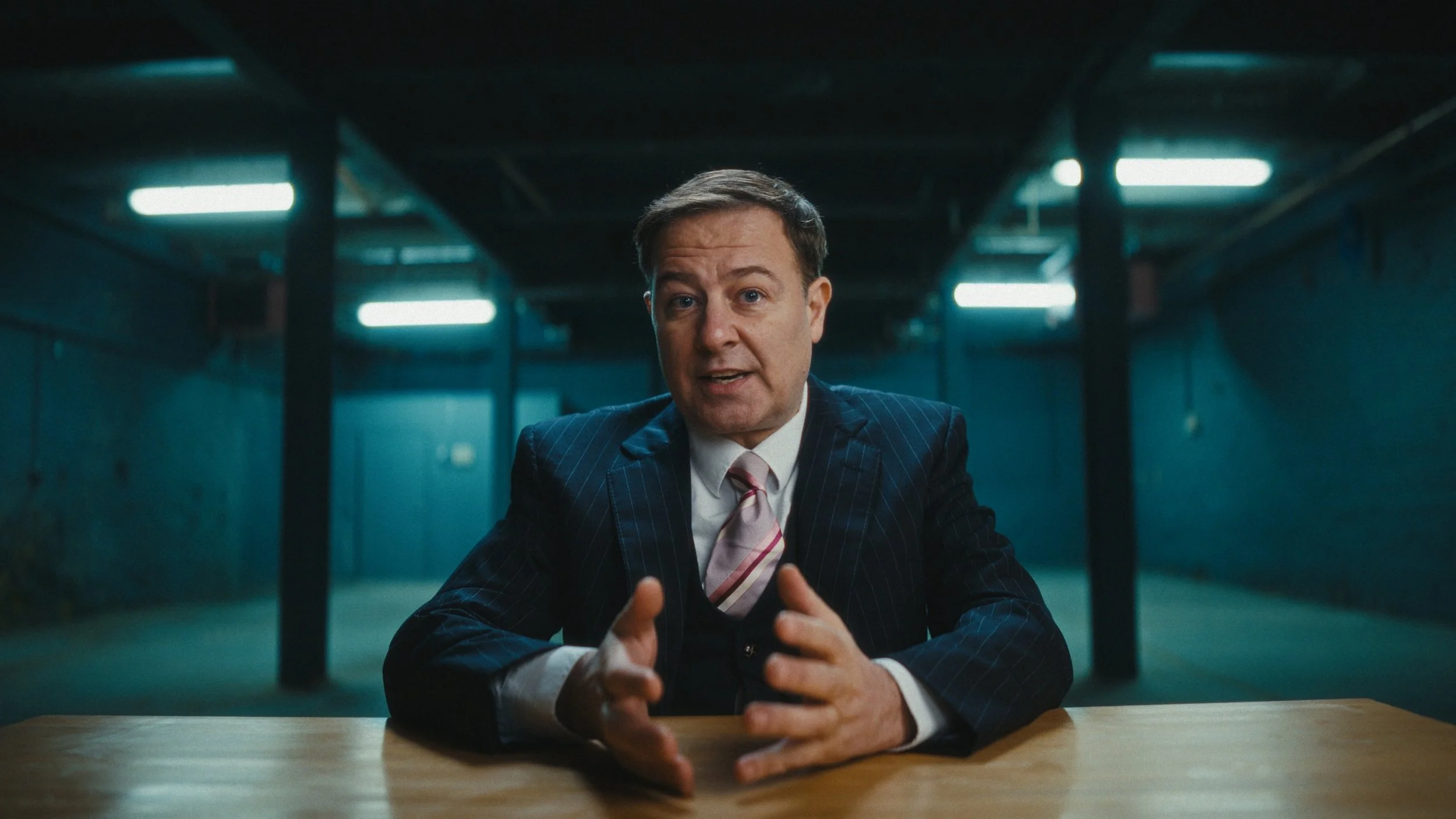
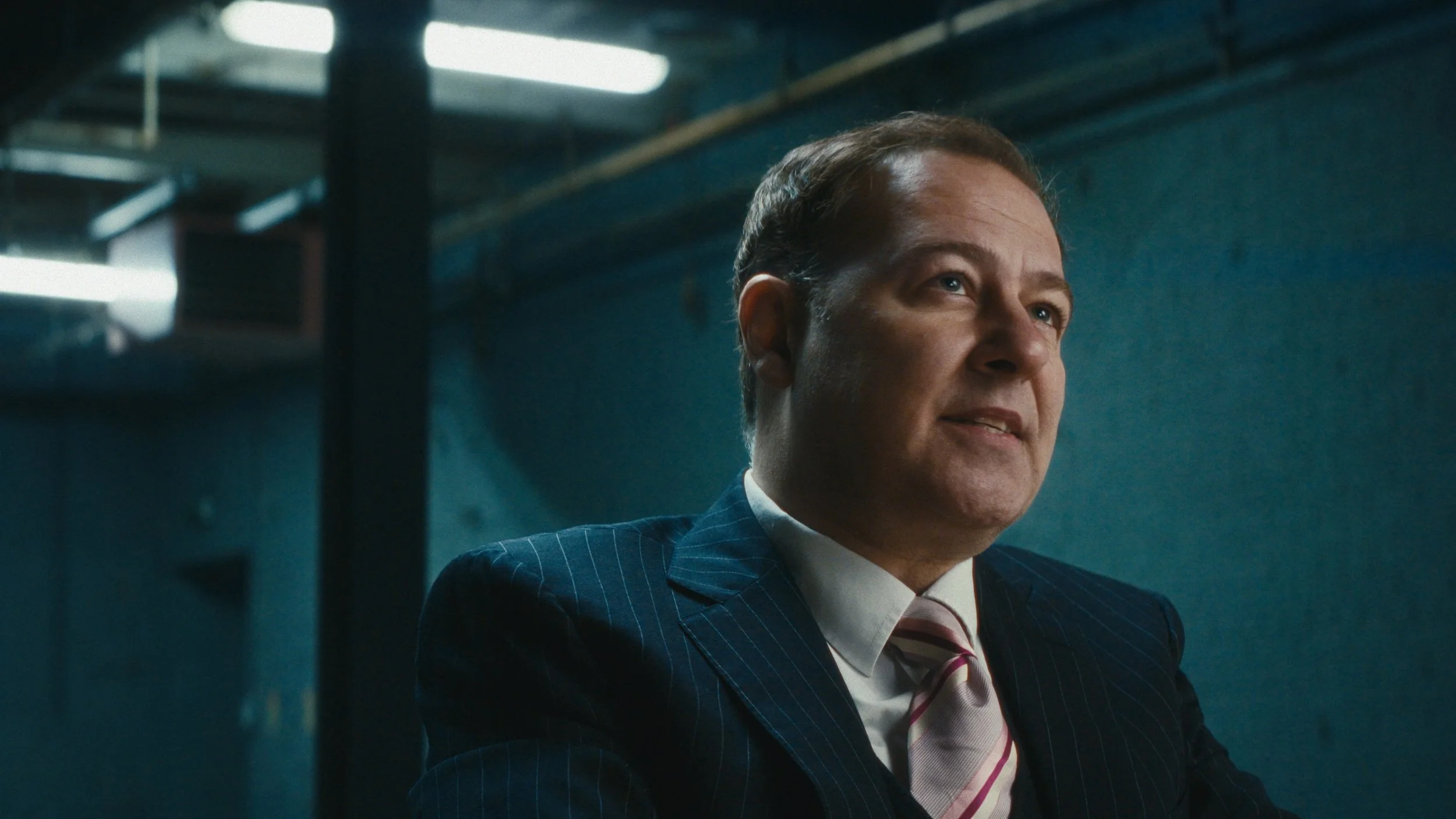
We were also incredibly fortunate to have Grant Gillespie come in to perform the role of the CEO on behalf of the police. Grant brought a level of restraint and unease that felt entirely believable — no melodrama, no signalling. His performance carried weight, which meant the cinematography needed to stay disciplined and out of the way.
Support from CanCan Productions helped make that possible, allowing us to cast properly and give the performance the attention it deserved. This film for West Yorkshire Police sits within a wider initiative to make cyber crime visible at a human scale. Rather than statistics or technical explanations, the aim was to focus on lived experience — how digital crime impacts real businesses, livelihoods and confidence across West Yorkshire. Cyber crime increasingly targets small and medium-sized organisations through phishing, ransomware and invoice fraud, often exploiting trust, time pressure and limited internal resources. In a region like ours, where many businesses are owner-run, locally rooted and digitally connected, the effects can be disproportionate and long-lasting. This witness-statement format was designed to make something abstract feel tangible and immediate, while also encouraging awareness, early reporting and resilience across the local business community.
The film was developed through a close working relationship between the police and Dave Hackney, ensuring the brief was clearly understood and handled with sensitivity. From early conversations, it was clear the piece needed to feel confrontational without being theatrical — direct, restrained and grounded in credibility.
Cameras, Lenses and Keeping Things Focused
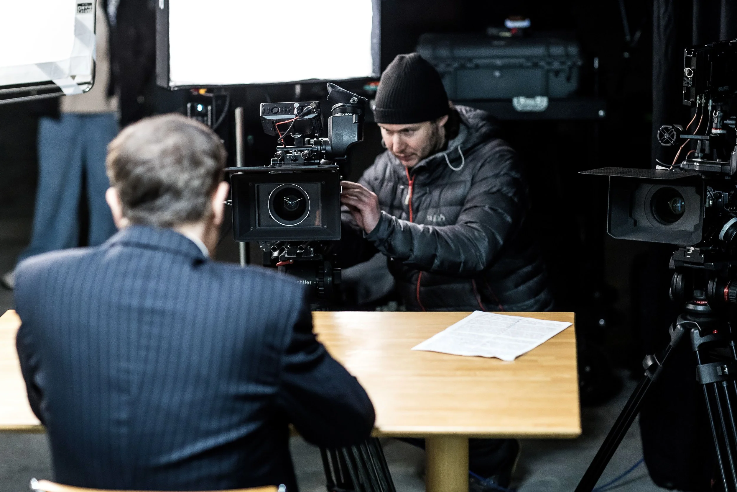
The cinematography followed a two-camera, interview-style setup with a dramatic edge. The A camera sat low and direct, with Grant addressing the lens head-on. The B camera was positioned slightly higher and off-axis to the left, offering an alternative perspective without breaking the intensity of the address.
Lens choice was deliberate but not showy. I used Viltrox 1.3× anamorphic lenses — a 35mm full-frame on A camera, paired with a 50mm on a Super 35 B camera. The pairing worked well: not identical, but close enough that neither shot felt like it belonged to a different film. The subtle anamorphic character added texture without pulling focus from the performance.
The cameras were matched in DaVinci Resolve and graded under a Kodak print emulation using Dehancer, pushing contrast and saturation just enough to give the image bite while keeping skin tones grounded.
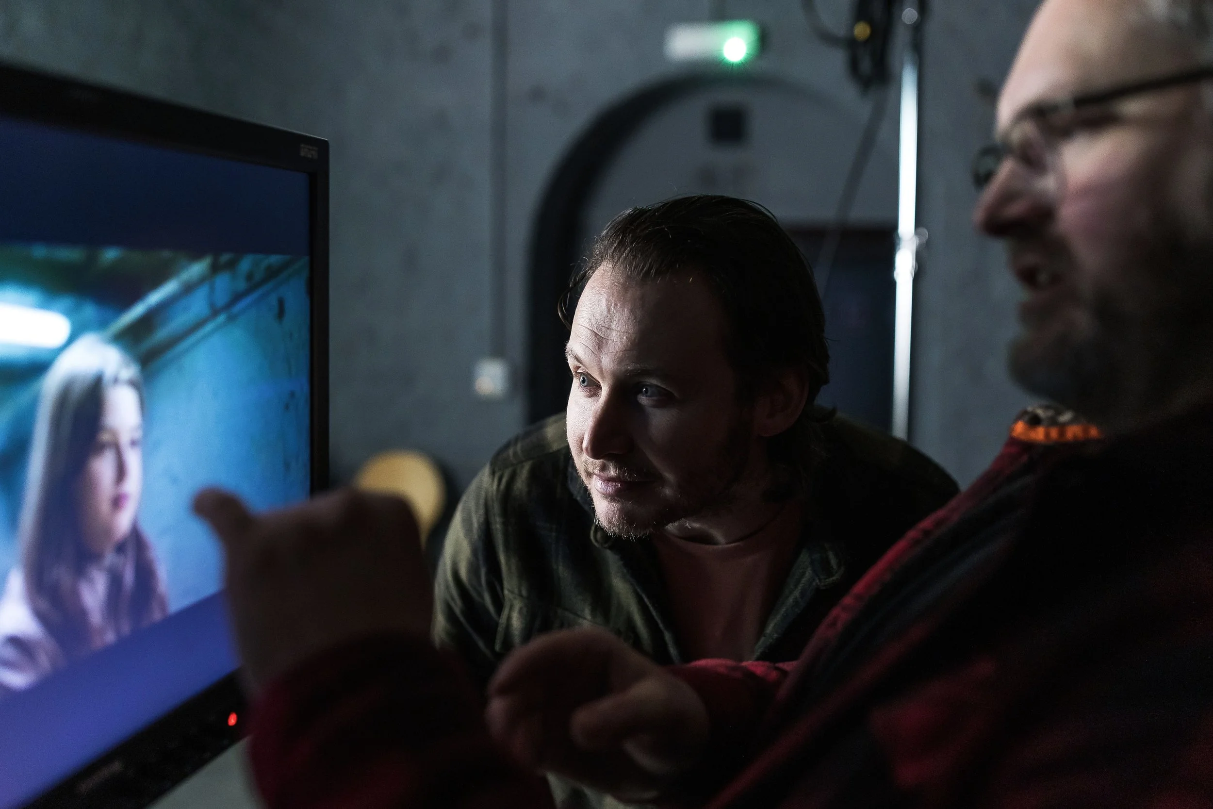
A & B Camera, Photos by John Steel
Lighting the Reality of the Space
The lighting approach was about shaping what was already there, not replacing it.
The main key came from a 4×4 frame of Magic Cloth positioned just to the right of camera. Pushing through it was a Godox Knowled 600M fitted with a Fresnel and barn doors. By focusing the beam and allowing a gentle hotspot to bloom on the diffusion, we created a slightly harder key than you’d normally expect for an interview — still flattering, but with an edge. The aim was a tougher, more confrontational feel, in keeping with the tone of high-end crime documentary work.
To camera left, a smaller 200W lamp with another fresnel working as a kicker. This was intentionally more directional, carving shape into the darkmside of the face and helping the image hold contrast without feeling lit for the sake of it.
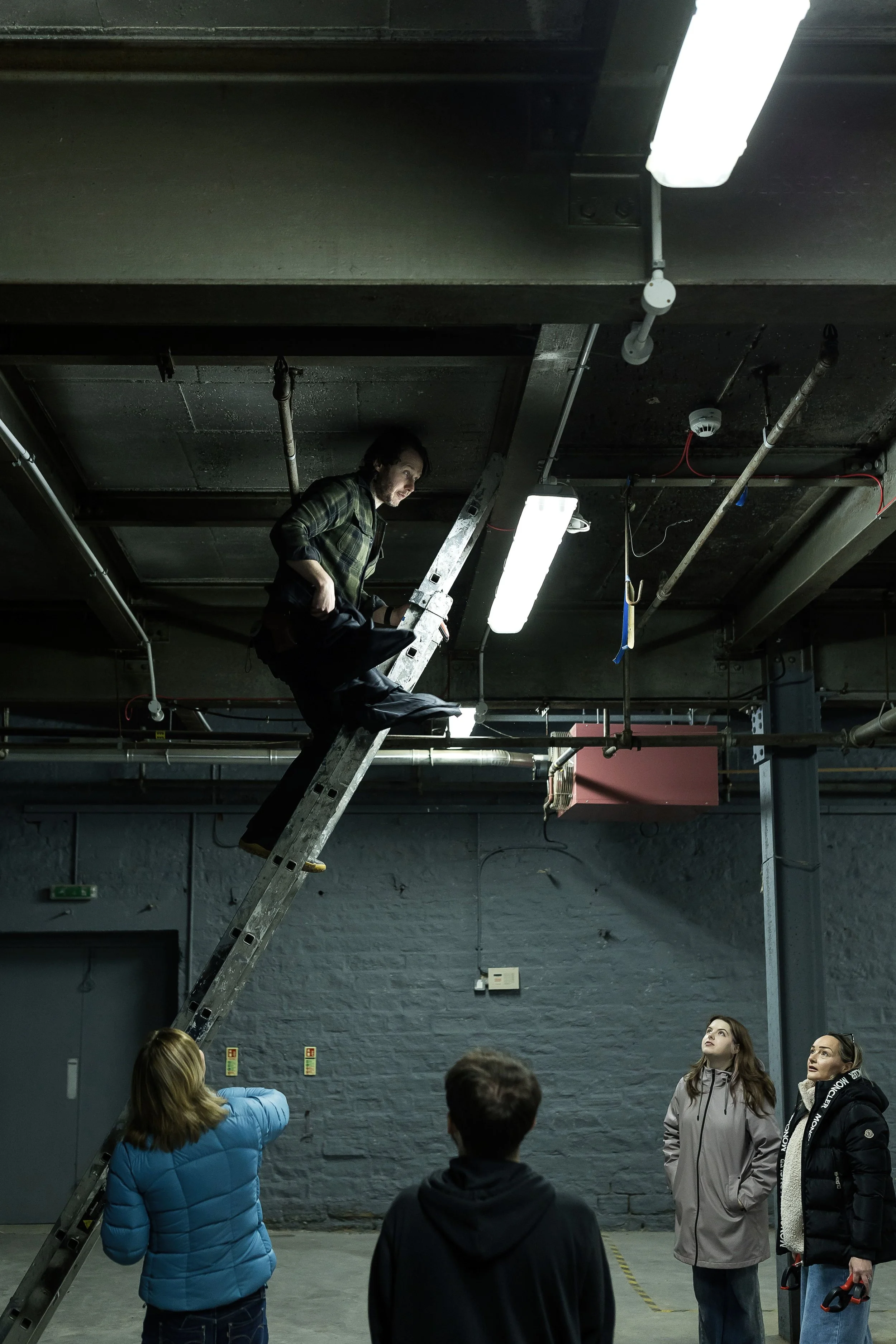
Overhead, an lantern provided a soft wrap, lifting Grant subtly away from the background and tying him into the space. These last two lights — the kicker and the overhead — were designed to integrate with the existing practical fixtures in the studio rather than override them. We also had a subtle fill light over the camera, more for an eye light than anything else and plenty of negative fill and sound blankets.
That integration was where colour control became essential.
The Setup
Using Colour Temperature to Take Control of the Space
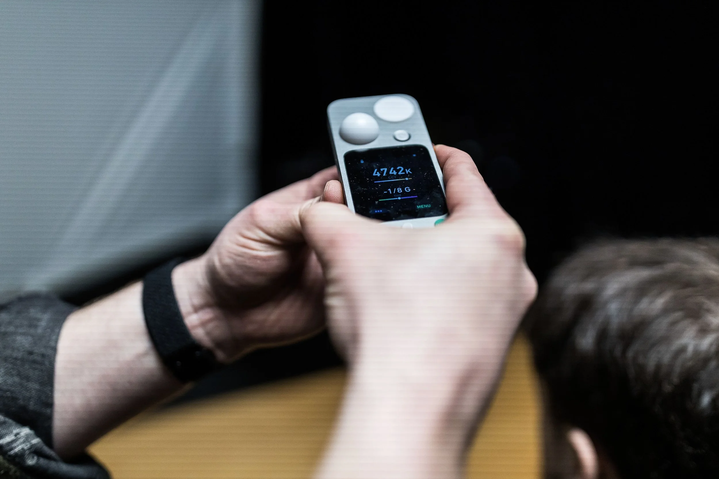
Rather than white-balancing to the room I set the camera slightly warmer than neutral — around 4000–4300K — and treated that as the emotional baseline of the image. This forced the practycial overheads, of which we had little control of in terms of output or colour into the blue green spectrum. I could dial the precise quality of this look into camera using colour temperature and tint.
The key light was matched closely to camera temperature, anchoring Grant in a neutral, believable place. Then in the grade I could intreuce a little more of the ‘roon tone’ back into grants skin tone. From there, we allowed the overhead practicals (LEDs in a fluorescent housing) to drift cooler, tipping gently blue-green. That contrast helped separate subject from space without announcing itself as a “look”.
LED fixtures, even good ones, are rarely exact. Two lights set to the same Kelvin value can differ noticeably in tint. Add practicals you can’t control, ageing fluorescent housings and mixed sources, and colour can start to drift in ways that are hard to spot by eye alone. The colour meter allowed me to measure not just colour temperature, but tint — particularly green and magenta bias — and then match our artificial lights to the existing sources in a realistic way. The goal wasn’t to neutralise everything, but to make the artificial feel like it belonged.
By adjusting the kicker and overhead lights to sit naturally alongside the practicals, we kept the image ‘real’ while still shaping it. The result was a heightened sense of reality rather than something overtly stylised.
Practical Control
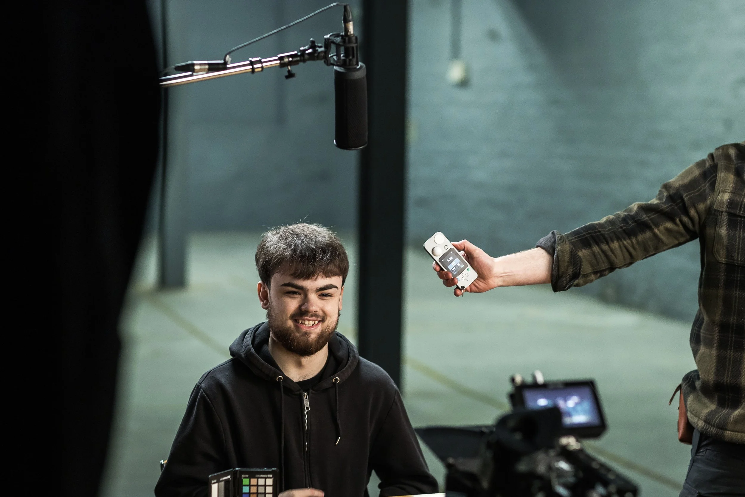
Lit Duo in Action
Devices like the LIT DUO 1 (which combines traditional light metering with advanced colour analysis) pack multiple measurement modes into one compact instrument. In Colour Temperature mode, you don’t just get a Kelvin reading — you also see how far a light is shifted towards green or magenta, which is critical when you’re blending practicals, fluorescents and LEDs that all want to sit in slightly different parts of the spectrum. You can display this info innthe folowing ways:
Δuv (Delta UV)
Delta UV describes how far a light source deviates from the black body locus — essentially the most “neutral” white for a given colour temperature.
A positive Δuv indicates a greenish shift
A negative Δuv indicates a magenta shift
This is the most technically precise way of describing tint and is often used in lighting engineering and colour science. In practice, it’s extremely sensitive — sometimes more so than you need on a documentary or interview shoot — but it’s useful for diagnosing why a light feels wrong even when its Kelvin reading looks correct.
CCI (Colour Correction Index)
CCI expresses tint deviation as a numeric value that relates more directly to colour correction requirements. It’s commonly used in broadcast and engineering environments and provides a clear sense of how much correction is required rather than just in which direction.
CCI is helpful when you want consistency across fixtures or locations, but it can feel a little abstract unless you’re used to thinking in correction units rather than gels or visual bias.
CC# (Colour Correction Number)
CC# values translate colour bias into a format traditionally associated with physical correction filters — essentially quantifying how strong a corrective filter would need to be.
This is particularly useful if you’re coming from a film or gel-based background, as it maps nicely onto how we’ve historically balanced mixed sources. It bridges the gap between modern LED measurement and older, still-relevant colour correction practices.
Green ± (Green / Magenta Plus–Minus)
This is the most intuitive mode for many shooters. It expresses tint bias directly as green or magenta, shown as a plus or minus value.
+Green means the source leans green
–Green (or +Magenta) means it leans magenta
I found this mode especially useful on this shoot because it aligns closely with how we already think on set: “This feels a bit green — how much do I need to pull it back?” It’s fast, readable and easy to act on, particularly when matching artificial lights to practicals or overhead fixtures.
The meter also includes a Full-Colour mode that lets you measure or match lights in broader terms, using CIE 1931 or HSI units, which is useful when you’re trying to judge how an RGB or bicolour fixture’s output will interact with existing sources rather than guessing from a single number. Another valuable feature is the tint sub-function, which suggests what correction filters you’d need to bring two different fixtures into closer agreement — a nice cross-check when you don't want to light-paint but you do want harmony. On top of that, the device lets you assess spectrum quality — looking at CRI, SSI and TLCI values — so you can see whether a light is actually delivering full, even colour or if it’s leaving gaps in certain hues that might only become apparent in skin tones.
Exposure Measurement
While we weren’t chasing lab-level precision, having that data in hand meant the overhead practicals, the kicker and the fill lights could be balanced in a way that felt right on the monitor and also sat comfortably with the real practicals in the room. It turns the abstract idea of “colour temperature” into something actionable on set — you can see where the bias lies, decide whether to lean into that bias or correct it, and then make the image work in camera rather than hoping to fix it later. And while colour is the headline feature, don’t overlook that this class of meter also integrates exposure, illuminance, spectrum and flicker modes (so you’re effectively carrying a suite of tools that historically lived in separate devices) meaning you can read light intensity, flicker frequency and colour all from one physical unit while you’re blocking and shaping your frame.
Seeing, Measuring and Carrying It Through
For me, measurement in all things, colour, exposure, cooking or even making coffee… supports instinct and it doesn’t replace it. The monitor is always the final judge. Plenty of DPs work entirely by eye, and that sensitivity is invaluable. I like having the extra information so that decisions are intentional rather than reactive.
I’m also fortunate to carry some of my work through to the grade, which means the intention set on the day survives into post. It’s not about control for its own sake, it just keeps the intention intact from set to final image.
Despite this post being a technical insight into a colour meter and epseically its ability to read the green/magenta tint of light, nothing here was about chasing perfect numbers or technical purity. It was about reducing uncertainty so that performance, story and tone could stay front and centre.
We returned to North Light because we already knew the space worked. This time, we simply asked a little more of it — different fixtures, more negative fill, a braver contrast ratio and a tighter relationship between colour and environment. The end result felt honest to the brief, respectful of the performance and rooted in the reality of the story we were telling and the place wwe were telling it.
And that, ultimately, is the job.
-
Huge thanks to the entire team - John Steel for the BTS images, Alfie for assisiting us, Natalia Mirren on sound, Dave Hackeny for leading the charge, the WYP Cyber Crimes team and to James and his generous people at North Light studios.
At the Monitor